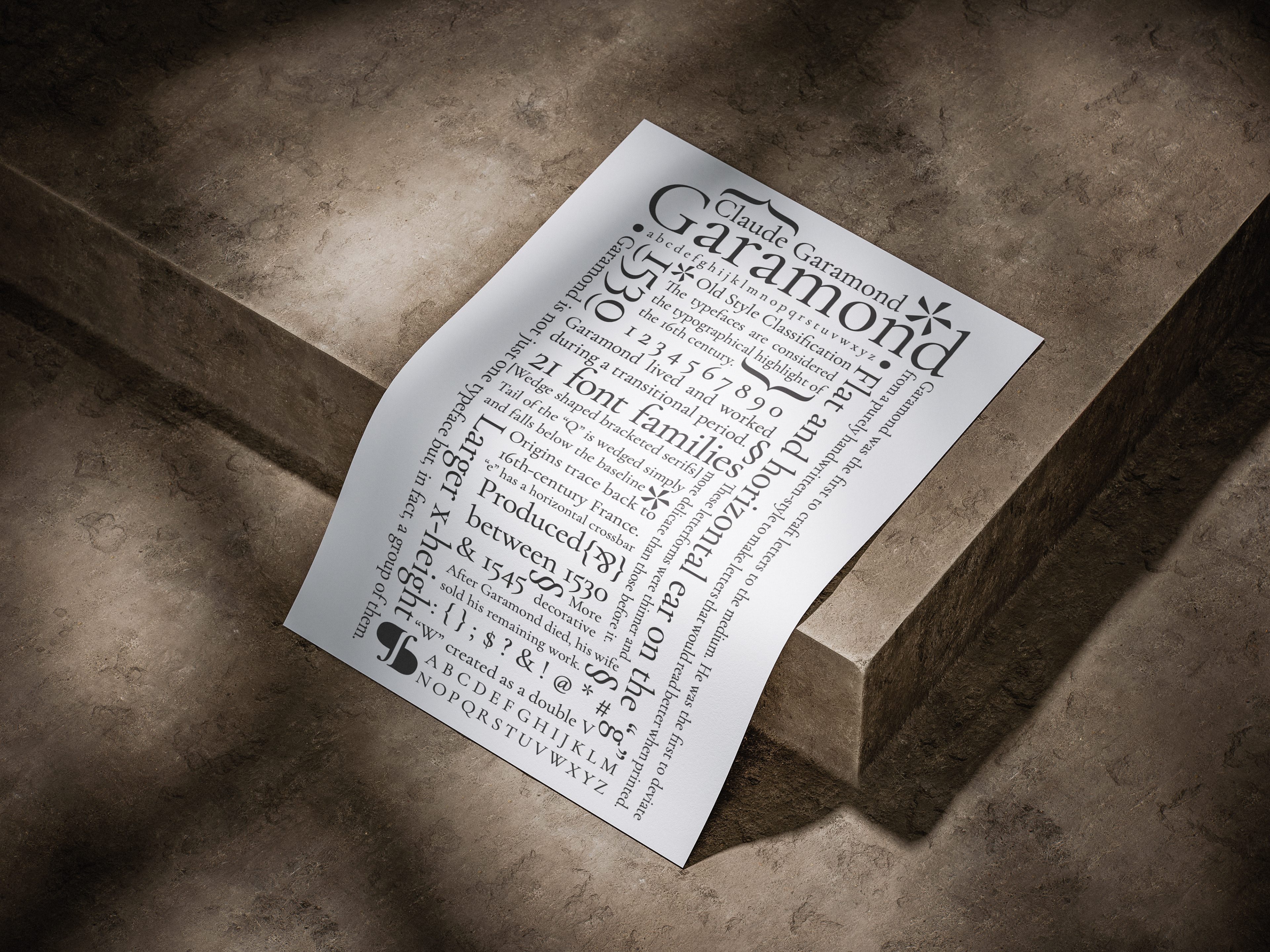
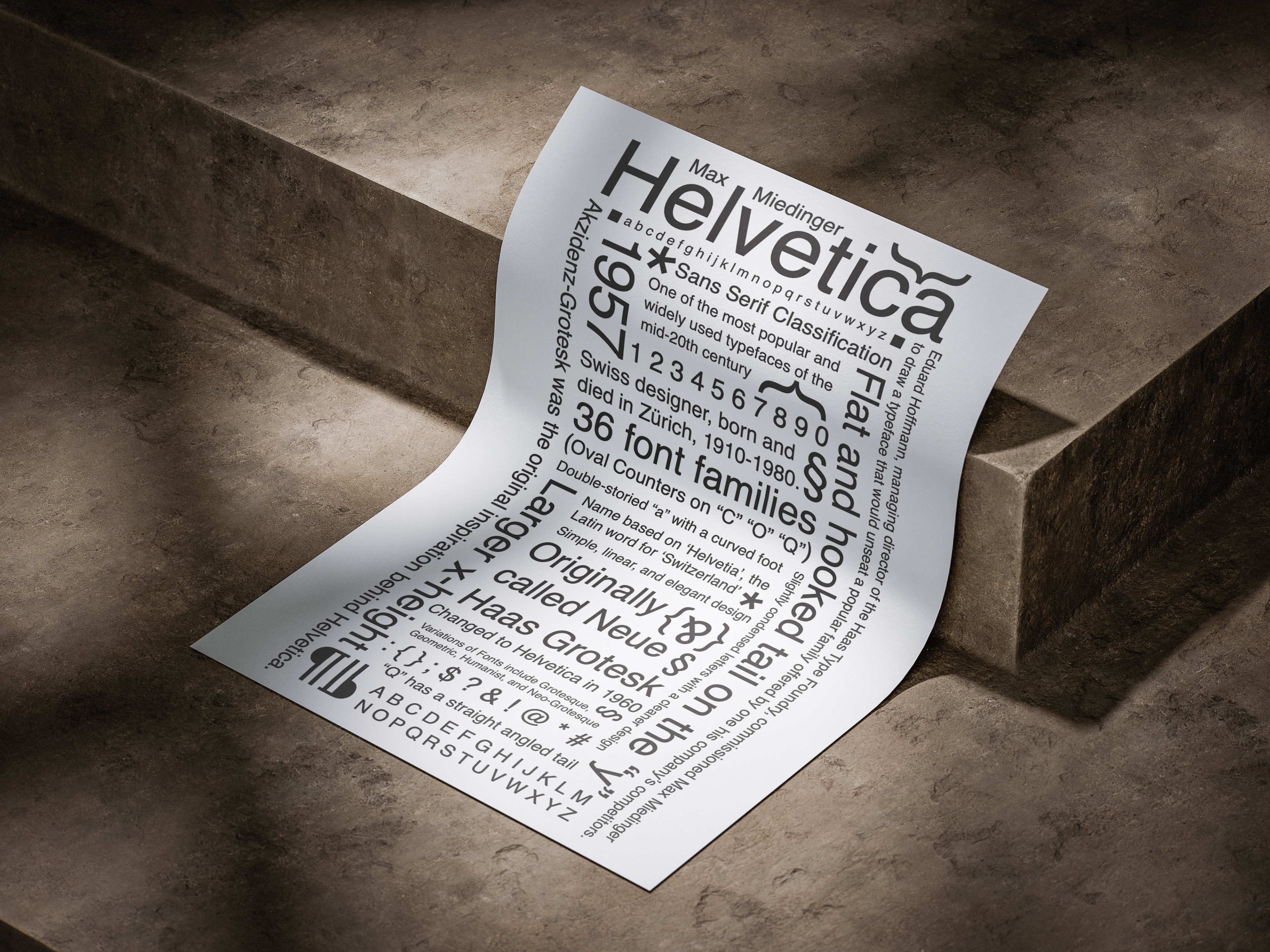
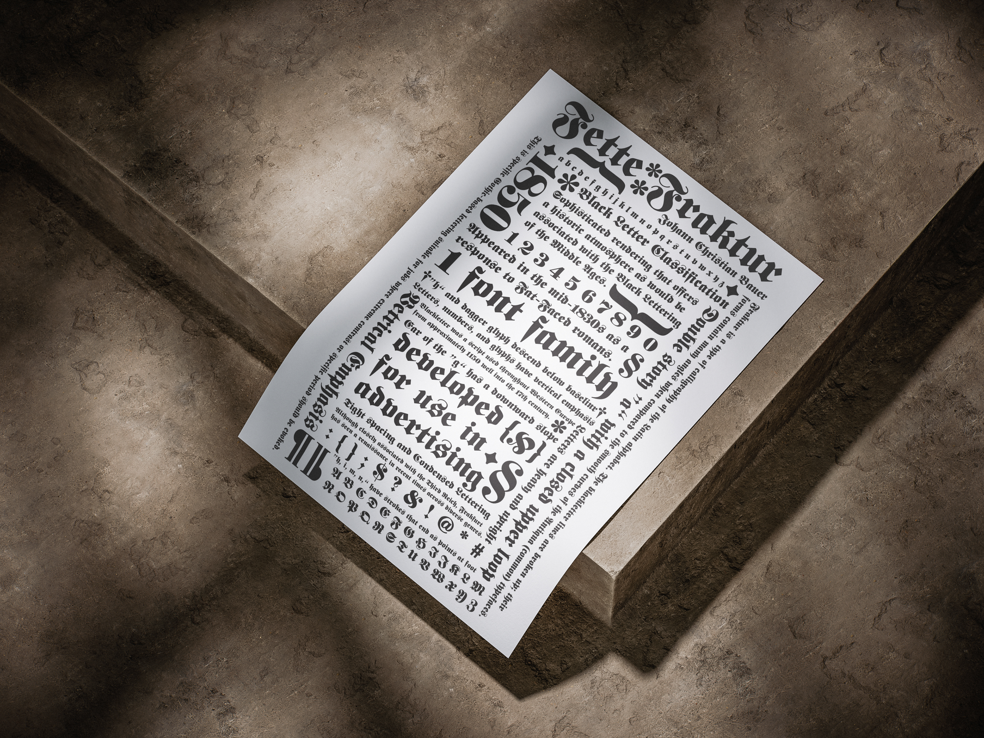

My client, a type enthusiast, asked me to make posters for the types, Garamond, Helvetica, and Fette Fraktur. The challenge was to not only make the posters, but also to give information on the types themselves, specifically the names backgrounds on who created the types and features of the types. The information needed to be in a design that would be intriguing to view and provide a lot for the viewer to look at and learn. The designs also needed to resemble each other in a way that they would relate as a group, even though they were of different classifications. My solution was to make each poster in reference to one another and have the posters be in a concise shape, making the pieces have a feeling of organized chaos; there is a lot that draws in your eye, but you can still find your way around it all and take in information.