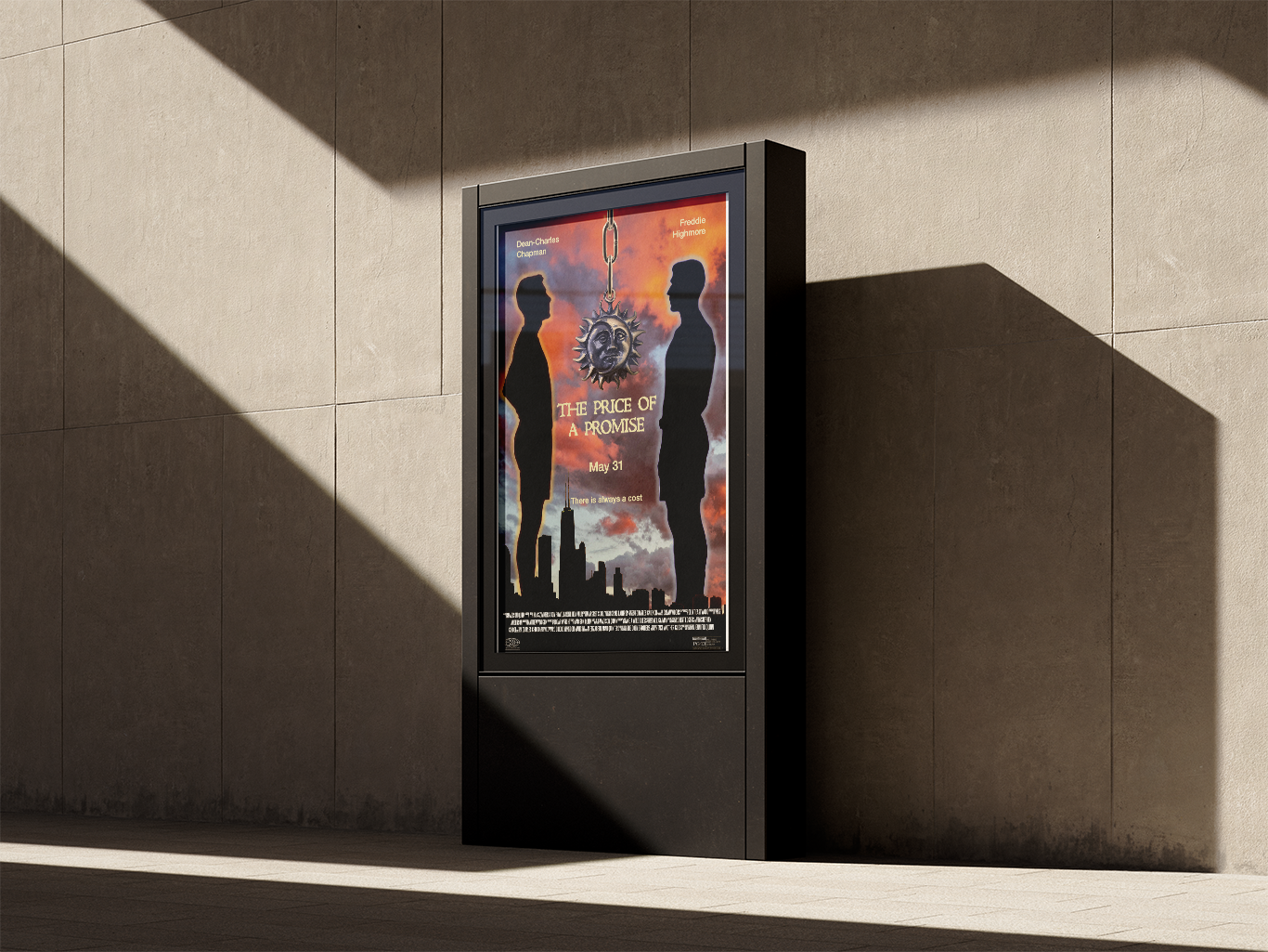
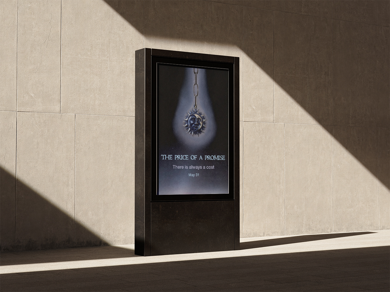
My client was an author of a book/novella that was making a film adaptation. My design challenge was to make a proposal of a movie poster for the adaption and try to relate the imagery to the most important elements of the book, as specified by the author, who had a large hand in the movie's production. My solution was to focus on the setting, silhouettes of the characters, to give a sense of intrigue for people new to the story and anticipation for people who had read the story before. I also tried to keep the type very simple but still balanced so nothing was overwhelming or out of place on the poster itself. When making the poster itself, I used royalty free stock images, as I was not able to take photos of the actors, props, and the setting, as a sort of frame work for when a more official poster is ready to be made and shown for advertising. For the second poster, my client asked for a teaser poster for the adaptation and wanted it to contrast it still relate to the poster from last week. My solution for this was to create a poster with colors and a background that opposed the movie poster, having 'night' imagery rather than sun and changing the color of the medallion and the type. The book's and the movie's target audience is geared more towards a young adult audience, roughly 16-20 year olds, but, as with before, the poster is made to evoke a sense of familiarity for readers and intrigue for new audience members experiencing the story for the first time.